“Don’t judge a book by its cover,” are wise words for life AND foolishness to someone designing the cover of a book.
I’m having a blast working with Josh on the cover design for my girl vs. rogue A.I. triller — Genevieve, the Fix. While there are lots of A.I.-powered cover generators that probably do a fine job, I thought it would be more fun to do it with some good old fashion human intelligence. It’s a weird, wrong, backwards place to start, but let’s talk color first.
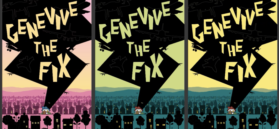
Here are the three colorways I tested with readers — Pink, Green 1 and Green 2. Which would you pick, and why? There are arguments for all of them.
Lots of young women like the pink colorway. While they used a variety words to describe it, the sentiment was that this version felt most “welcoming.” That’s good, right. I mean, I want readers to feel welcomed enough by the cover to pick it up, read a few lines and buy it. Right?
But while “welcomed” is a great emotion, it isn’t the right emotion for this story. I mean, the first paragraphs are anything but welcoming. I’d have to “pink” those up too.
Second was Green 1. People thought this one felt more mysterious and scarier than the pink. In other words — not welcoming — like my resting face. 🙁
Third was Green 2. This is an interesting color. Josh says it’s the color of a Michigan sky, right before an epic storm breaks. If you’re from the midwest, you know the color. It’s an unsetting color. Everything just looks off. You want to stand and wonder at it for a while but the animal inside you insists on running for cover instead.
Yikes! That’s the right emotion for this book. It’s written to evoke a hundred Yikes,’ a hundred different ways — and every part of the cover is designed that way.
Can you feel it?